Ask the Expert: How Do Paint Colors Get Their Names?
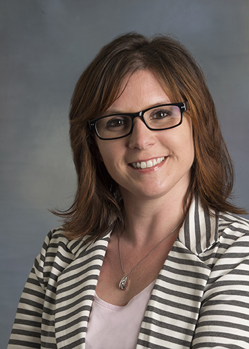
Are you color obsessed? Do you loving poring over not just the actual paint colors, but the incredibly creative names? Whether you're a DIY painter or you've hired a pro, you can probably name a few paint colors, and you may have wondered where those names came from. We talked to two women who're responsible for those names, and it was eye opening! Dee Schlotter, senior color marketing manager, and Misty Yeomans, color marketing manager, both with PPG Architectural Coatings, are responsible for the implementation of all color programs for PPG paint brands in home centers, independent dealers and company-owned stores. PPG paint brands include Olympic® Paints and Glidden® paint, as well as PPG Paints™, PPG Pittsburgh Paints® and PPG Porter Paints® which are on PPG’s Voice of Color® system. Read on to see what they have to say about naming the colors we love.
1. What color trend are you most excited for in 2016?
Dee I love the - Lucid Dreams palette in PPG’s 2016 Color and Design trends booklet, which is compiled of nuanced, grayed-off pastels. The colors meld together to create a soft, comforting combination that offers an escape from a constantly connected world. We recommend pairing the ethereal pastels, such as Gray Frost (PPG1012-4), Geyser (PPG1138-2) and Mother of Pearl (PPG1100-1) with dark gray and blacks as an accent hue.
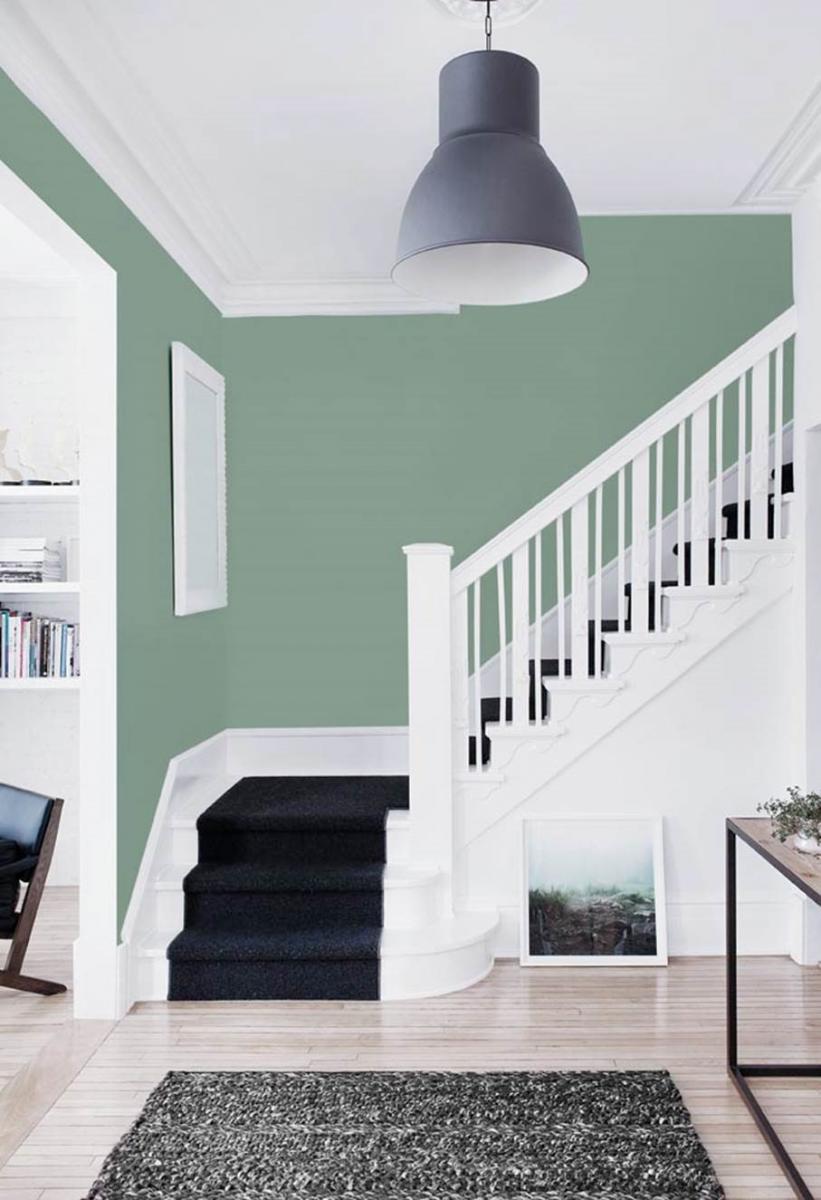
In addition, Paradise Found, PPG’s Voice of Color 2016 Color of the Year, is a favorite color of mine for next year. Part of PPG’s Knight’s Watch trend palette, Paradise Found (PPG1135-5) is a substantial green that offers a soothing, safe feeling. The organic green also represents the ease and rejuvenation one feels in nature. With a hint of blue undertones, it pairs beautifully with whites.
To view the PPG’s Voice of Color 2016 color trend palettes, go to http://www.ppgvoiceofcolor.com/trends/odyssey-color-trends
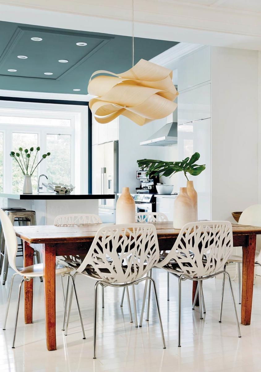
Misty – For 2016, I’m most excited about Glidden paint’s Color of the Year – Cappuccino White (45YY 74/073). This white offers silence and creates a calm lightness in any space, which is key to create a retreat from the hectic landscape of everyday life. What I really love about this color is its versatility – it’s far from boring! Cappuccino White has personality, enabling it to stand alone beautifully, or anchor an array of colors for a stunning effect. We recommend pairing it with trending pastels for a sophisticated look, such as a soft pink like Sonata Mauve (30RR 30/103), a soothing teal like Sea Spray (30BG 56/097), a violet-like Frosted Mulberry (70RB 18/117), and a stone gray like Nocturnal Creek (30BG 31/053).
Glidden paint is sold at The Home Depot and Walmart. The PPG Paints brand on the PPG Voice of Color platform is sold at PPG Paints stores and independent dealers.

2. How did you come up with the name Paradise Found?
The Paradise Found name was submitted to the PPG Architectural Coatings color marketing team by an employee. We often ask colleagues for help in naming colors, and one employee submitted the name after seeing the shade among about 25 other colors that we needed help naming. I thought it fit nicely.
3. Do you ever create a series of color names? (ex: Paradise Lost, Paradise Found, Paradise Regained) If so, what was your favorite series and why?
We have done themed color names, such as in our regional collections. We have palettes named Nashville, Alaska, Charleston and more – all of these colors are renamed to go with the region. For example, in the Alaska palette, the color names include Salmon Run, Little Bear, Yukon Gold, 49th Blue and Pretty in Sockeye that is inspired by the state, its landscape and culture.

4. What’s the most popular color you’ve ever named?
Pony Tail (PPG1086-4) – it is our best true beige color and a favorite among many consumers! The color was named after our research and development color director’s daughter. She was an equestrian rider and it was the exact color of her actual pony tail.
5. What do you do when you get writer’s block on a color?
We engage the whole marketing team, even from other business units within PPG, and sometimes we even go to our kids for inspiration. They are good at providing unfiltered suggestions. We also like to reference thesaurus or nature books.
6. Anything else you’d like to add about paint colors or naming colors?
It’s a tough job, but someone has to do it. We actually only spend about five percent of our total time naming colors – there is a lot more than goes into color marketing than what meets the eye. Color naming is certainly one of the most fun, yet challenging, parts of our job! We love it.

Dee Schlotter, senior color marketing manager, PPG Architectural Coatings

Misty Yeomans, color marketing manager, PPG Architectural Coatings
